Color Trends for 2023
- Nov 11, 2022
- 3 min read
Every 10 years or so, there is a dominant trend in the world of color, and we’re seeing a definitive shift in our collective color palettes. In the early 2000’s, gray was everywhere:

And it was presumably a reaction to the Tuscan brown trend that was SO popular in the 90’s:

In recent years, however, we’re noticing a shift towards a resurrengence of color everywhere. It could be considered a reaction (or is a bit of a backlash?) to those cool grays and black & white combinations that dominated the design world. But now, we’re noticing the re-introduction of color in a way that pulls in much warmer hues than have recently been seen.
Even more, we’re seeing deeply saturated colors play a big role in our designs, where verdant greens, cozy terra cottas, and deep brown hues are everywhere, from paint colors to furnishings. These jewel-toned hues provide a feeling of cocooning warmth, infusing rooms with character.
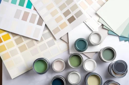
With a strong desire for a collective return to normalcy, and a (dare I say?) optimism to the future, we are looking for ways to bring joy into our homes, and there’s no better way than with a color that you love. Below are the Color of the Year selections from our favorite paint brands:
Sherwin Williams: Redend Point
Sherwin Williams recently debuted their Colormix Forecast of 2023 with forty different on-trend hues, ranging from bold to neutral. Their Color of the Year for their palette was Redend Point, a sophisticated, deeper blush hue. They describe it as a “minimal yet cozy, this color creates a comforting backdrop for the everyday moments that matter. Embrace a spirit of connection with the world around us with this soulful-yet-subtle hue.”
Even if you don't use it on the walls of a space, this color has been trending everywhere in rugs, textiles, and other decorative accessories.


Redend Point by Sherwin Williams
Benjamin Moore: Raspberry Blush
An even more bold and vivacious choice is Raspberry Blush, Benjamin Moore’s Color of the Year. Described as a “vivacious shade of coral tinged with pink, Raspberry Blush enlivens the senses with an electric optimism. Never a backdrop, Raspberry Blush is the definition of charismatic color.”
Pairing this shade with other understated and warm neutrals allows it to shine. And looking at this hue just makes us feel happy and upbeat - exactly what we need right now.


Raspberry Blush by Benjamin Moore
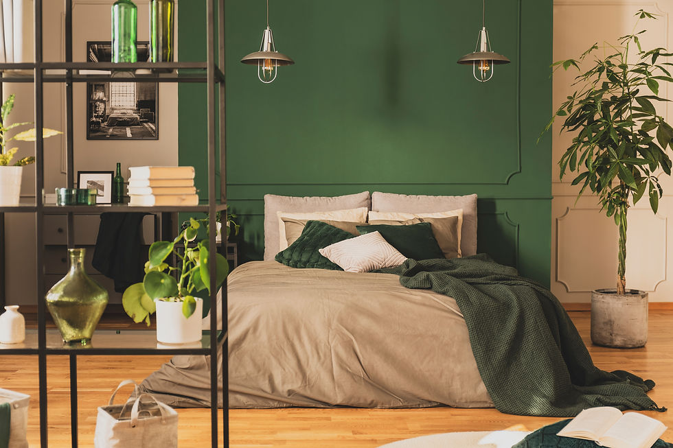
PPG: Vining Ivy
With a bit nostalgia and nod to the contemporary, PPG’s Vining Ivy is a bold, jewel-toned color that takes center stage. Described as a “deep, shaded, Caribbean aqua with a turquoise undertone,” It’s soothing blue-green hue can be right at home with medium to deep toned woods, and warm metals like antiqued brass. As seen so often in last year’s palettes, shades of greens and blues go a long way toward providing rejuvenating and soothing spaces in our homes.


PPG's Vining Ivy
Graham & Brown: Alizarin
Wallpaper design company Graham & Brown launched their complementary paint collection in 2019, and this year, chose a bold auburn hue called “Alizarin” as their choice for 2023. Celebrating this “deep and moody yet refreshingly warm” hue, it’s named after the pigment derived from the Rubia plant species historically used as dye throughout the world. “This rich red will take you on a journey to ancient and exotic lands. Use in small spaces to create a cocooning effect or transform larger rooms into an opulent abode.”
And of course, they have a variety of wallpaper that pair perfectly with this paint (as well as many other coordinated selections.)


Graham & Brown's Alizarin
Dunn-Edwards: Terra Rose
Continuing on with colors that exude warmth, Terra Rosa by Dunn-Edwards is a lush, rosy pink that’s sweet without being sacchrine. Celebrating beauty but also creating drama with it’s saturated hue, this color is the perfect backdrop for a cozy living space or bedroom.
With a focus on “health and wellbeing first, making time for escapism and embracing nostalgia ... This translates to design through lush, sophisticated touches with equal parts prettiness and drama," said Sara McLean, color expert and stylist for Dunn-Edwards.


Dunn and Edward's Terra Rosa
What do you think of this year's hues? Drop a comment below and let us know which one is your favorite!