
Using Inspiration to Create a Color Palette for Your Home
- Mar 10, 2022
- 3 min read
So many clients come to me because they struggle with choosing a cohesive color palette for their home. They're not quite sure how to combine colors and want to understand what the current trends are. For so long, the trend has been white + grey + more white, but we're starting to see more of a glorious color resurgence.
Even if you're working with a designer, it's always helpful for us to know what colors you tend to gravitate towards. If you love the deep green hues that are popular right now, or can't stand the periwinkle trend, it's important to know that before beginning your project.

The Science
Before we dive into how to create an actual palette for your space, let's start with a little science. There are photoreceptors called "cones" on your retina that are responsible for color vision. Most people have three - red, blue, and green - and the information from these three cones combines to create our color perception. This allows us to combine various combinations of these and "see" approximately 1 million colors.

There's also evidence that shows that some people have four types of cones including an additional orange one. According to color vision researcher Dr. Jay Neitz, only women can have four types of cones. So if your husband is staring at paint swatches at Sherwin Williams with you, and having a hard time distinguishing between Worldly Gray and Popular Gray, it may actually be a valid problem!
...And the Math
I've said it before and I stand by it: part, though not all, of interior design involves math. And even something as visual as color is no exception. Introducing:
The 60/30/10 + POB Rule
This classic rule of decorating means that you should choose three colors in proportion to each other for your room's color palette:
A dominant color for about 60% of the items
A secondary color for 30% of the items
An accent color, sprinkled in at 10%
And finally, a pop of black (or POB) if not already used, to ground and unify the space
Pro Tip: One way that I often find inspiration for rooms is by starting with either an area rug or a piece of artwork that you love. Doing this can help you to identify your “60/30/10" based on the composition of that item.
Here's an example breakdown:

Example 1: Use Artwork as a Starting Point
Let's walk through an example using this gorgeous print ("Riverside") from The Juniper Print Shop:

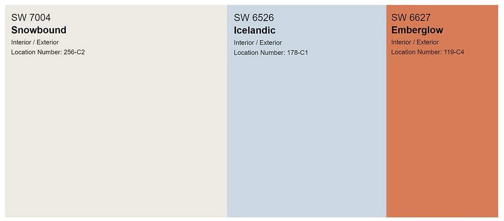
Based on the colors in this print, I would create a color palette in the 60/30/10 combination:
Now let's take a look at the color scheme applied to a room:

Here, we are grounded in neutrals on some of the walls and sofa (60%) , with some light blue on the walls and accents (30%), and pops of the sunny orange (10%) throughout. Greenery is also added to bring in a more organic feel to the space. Also notice the black picture frame, drapery hardware, and metal touches on furnishings for the POB (pop of black) that is repeated throughout the room.
Example 2: Use an Area Rug as Inspiration
Let's say that you're leisurely scrolling through your feed, and you spot a rug that you love, like this rich olive, vintage-inspired one from Loloi:

Based on this rug, I would create a moody color palette that focused on the olive green tones in the 60/30/10 framework:

From that palette, apply this to a room, and it will feel warm, inviting, and cozy. The deep green takes center stage on the walls (60%) , the bedding echos the accenting apricot tones (30%), and the white on the door, trim and sheets (10%) gives your eye a bit of freshness. And again, the pop of black (POB) is present on the bedframe and nightstand to unify the colors.

Resources:
As a rule-following firstborn, I always consult a great guide book. Check out my favorite books on color below for a start on your color journey.
I have this on my shelf - it gives you tons of different color combos in the 60/30/10 format!

A fantastic book about color theory, and examples of how color can be used in real, inspirational rooms.

The first book from design powerhouse Pamola Contreras, this book shows you how to find your inspiration -- along with so much eye candy!

(This post contains affiliate links, and I make a small commission if you purchase through these links, at no cost to you.)
The bottom line: Don't be afraid of color! There are techniques to making it feel cohesive, and beautiful starting with (yes!) math and proportional use. If you're still feeling stuck, reach out to us for help!
